Name: Our Polly's Wedding Hell
Source: Radio Times
Analysis:
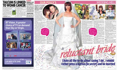
Although this double page spread is also from Radio Times, it is very different. It uses one main image of the subject of the article, in the center of the page and many smaller images in order to set the scene. This draws the eye to the images before reading the text. This is a technique used to shock the audience and draw them in. I would like to use this technique in my own work as I would like my message of children growing up too fast to come across in all three of my media texts.
As unconventional as the layout of this images is the text has been laid out in columns which is conventional of all magazines. The font used on the pull quote is bolder and surrounded by a pink speach bubble, which shows the audience this quote is important to the article. A drop capital is also used in the article, which is at the start of the article. This double page spread is not advertising a TV program, however the conventional use of bolder text at the begining in order to set the sceen is something I wish to use in my own work.
The representation in this double page spread, of a young, 20-30 year old woman, is completely different to my own, which will be that of young girls who are interested in make up. However this representation would in some way attract a similar audience to my own.
No comments:
Post a Comment